
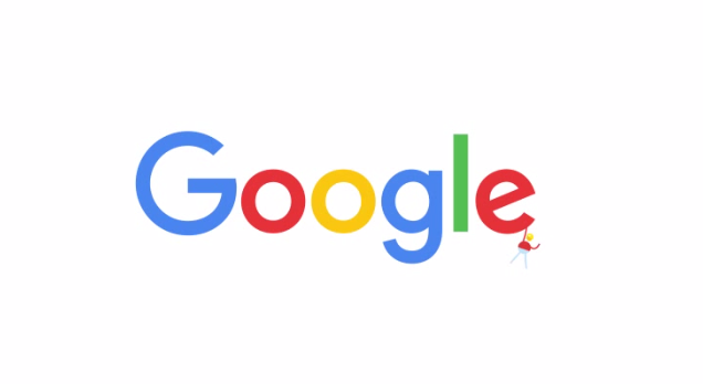
After 17 years of sameness, Google has just unveiled a brand new logo. As one of the most well-known brands in the world (aside from Coca-Cola and the American Red Cross), it’s a rather surprising change for the search engine giant.
On Twitter, Google posted a .gif of the alternative rainbow-themed logo showing off a more blocky and serif-less font, much like Helvetica or Microsoft Word’s Calibri. The post includes a link to a YouTube video explaining the brand new Google logo after nearly two decades. Google also announced the change on its blog.
We’ve changed a lot over the last 17 years, and today we’re changing things up again… http://t.co/gjK5Csd0pPpic.twitter.com/nNNMshhBat
— Google (@google) September 1, 2015

The blog post explanation can be read below:
So why are we doing this now? Once upon a time, Google was one destination that you reached from one device: a desktop PC. These days, people interact with Google products across many different platforms, apps and devices—sometimes all in a single day. You expect Google to help you whenever and wherever you need it, whether it’s on your mobile phone, TV, watch, the dashboard in your car, and yes, even a desktop!
Today we’re introducing a new logo and identity family that reflects this reality and shows you when the Google magic is working for you, even on the tiniest screens. As you’ll see, we’ve taken the Google logo and branding, which were originally built for a single desktop browser page, and updated them for a world of seamless computing across an endless number of devices and different kinds of inputs (such as tap, type and talk).
While the YouTube video doesn’t give much of an explanation, it does account for many of the updates and changes Google has made through its web-based search, software, and technology innovations over the years. Of course, the change is also quite relevant to Google’s recent reorganization, which separated its software and search divisions and technology innovations under the company Alphabet.
Check it out for yourself below.
Source: Google